Pilot Logbook Statistics and Visualisations

A Labour of Love
To start, I want to say a huge thank-you to everyone who has visited my pilot logbook statistics and visualisations page and provided feedback, suggestions, and encouragement.
It has been a labour of love to create this page, and I am thrilled that so many people have found it interesting. Special thanks to the Hacker News community for all of the encouraging comments and suggestions - what a great community!
Why build this?
I have always been fascinated by data visualisation and the stories that data can tell.
As a pilot, I have accumulated a lot of flight data over the years, and I wanted to find a way to make it more accessible and visually appealing.
My old website used to have a single number on my pilot page: my total number of hours flown. I would have to manually update this every few weeks/months, but I like automation, dislike repetition, and dislike repetition - so a fix was needed.
This new website is built using the fantastic Astro react framework (vs my Flask-Flatpages previous website). The ability to easily add interactive React components opened up the door to a whole new world of possibilities for visualising my flight data.
On The Shoulders of Giants
I have a background in software engineering, and I am passionate about nice user interfaces, but data visualisation is a whole different beast.

There are two main libraries that I used to create the visualisations on my pilot logbook page:
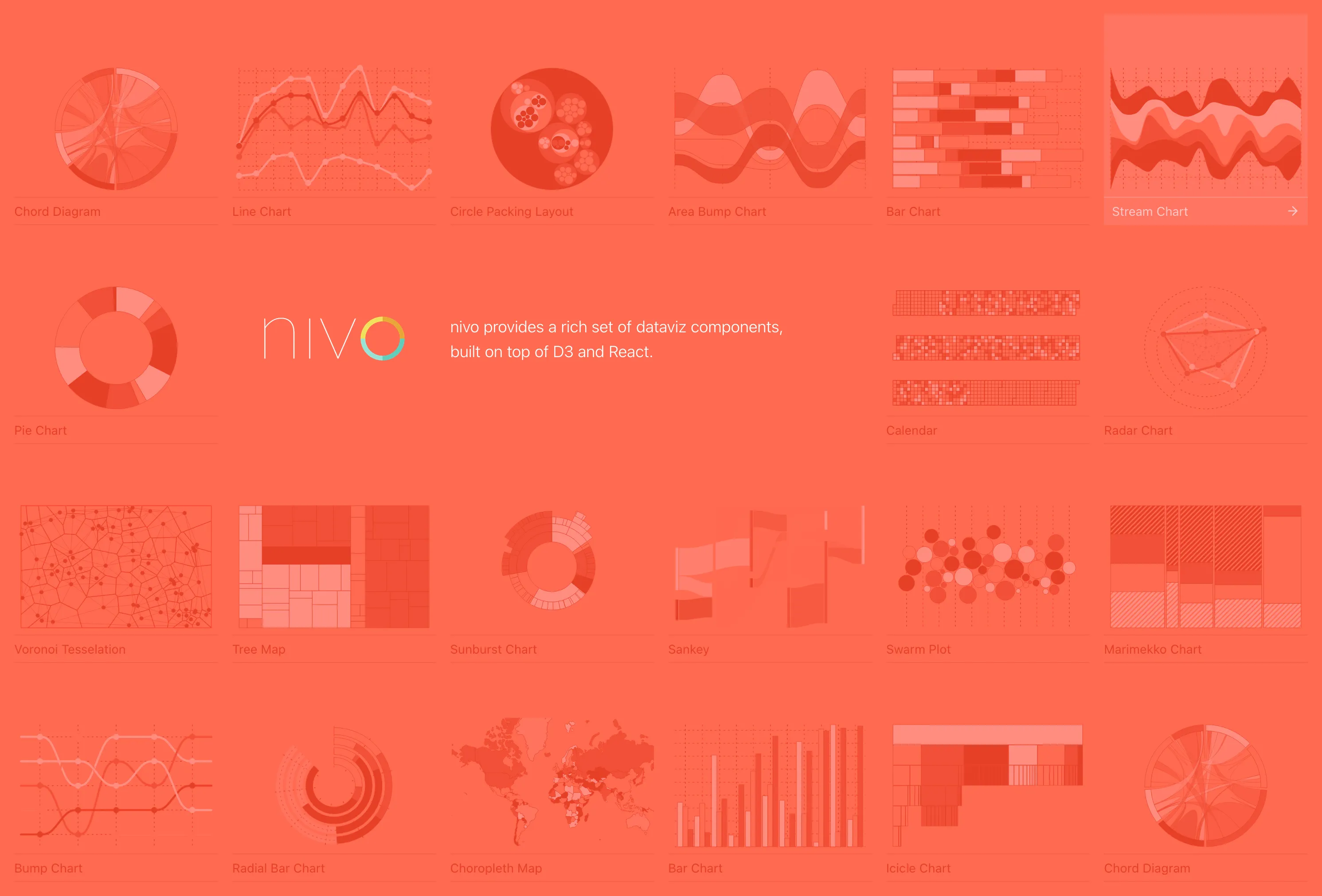
- Nivo: A powerful data visualisation library that provides a wide range of chart types and is built on top of D3.js.
- globe.gl: A library for creating 3D globes and visualising geospatial data.
Both of these libraries are open source and have been a joy to work with. They have allowed me to create some really interesting visualisations without needing to dive deep into WebGL and SVG generation - all I needed to figure out was how to transform my data into the correct format.
The Backend
I have a small web service that I use personally to manage my pilot logbook data and to share my upcoming flights with family and friends.
Building on top of this, I added a few API endpoints to produce the JSON needed for the charts. This involved writing some simple SQL queries on my logbook’s SQLite file, and where possible I tried to keep all of the logic in SQL.
For example, to get the total number of hours flown per day for my github-style activity heatmap, I can run a query like this:
SELECT
    date as day,
    count(to_) AS no_flights,
    round(sum(total_time), 1) AS value
FROM logbook
GROUP BY date;
and then return that data as JSON to the frontend like this:
con = sqlite3.connect("logbook_file.sqlite")
con.row_factory = sqlite3.Row

cur = con.cursor()
res = cur.execute("<THE QUERY UP ABOVE ☝️>")

return jsonify({
    "calendar": [dict(x) for x in res.fetchall()],
})
Since each graph needs data in slightly different formats, I have a few different endpoints that return the data in the format needed for each graph with minimal duplication of code.
As much as possible, I try to keep the logic in the SQL queries for performance, the data is also cached where possible.
More creativity needed
I have had some great suggestions for additional visualisations, such as:
- Radiation exposure
- Carbon footprint (probably a scary number)
- Number of passengers carried
If you have any ideas for new visualisations, please let me know!