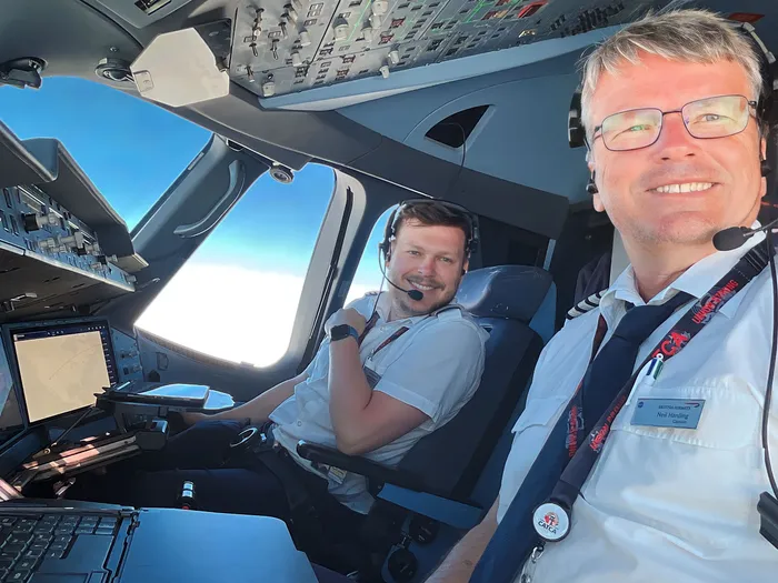
I am an Airbus A350 Pilot
Since 2023, I have been a First Officer on the Airbus A350 with British Airways operating out of London Heathrow. Prior to this, I flew the Airbus A320 family based at Heathrow and Gatwick since 2016.
I joined British Airways through their cadet scheme in 2014, which included an Integrated ATPL course that I completed at FTEJerez in Andalucia, Spain 🇪🇸. My flying journey began in Canada 🇨🇦, where I obtained my Glider Pilot License, Instructor Rating, and my PPL through Canadian Air Cadet scholarships.
Statistics
I log all of my flights digitally using LogTen Pro, which lets me query them using SQL and present them in infographic format. My favourite is the GitHub-style flying history.
Career Highlights & Stats
Before we get to the graphs (which are cooler, let's be honest), I have some headline figures to share.
A lot of these suggestions came from Hacker News comments and emails. Thank you for all the inspiration! Let me know if you have any more ideas.
The time dilation is an interesting one: the high cruising speeds (special relativity) lead to negative dilation, but the effect of lower gravity (general relativity) gives positive dilation. General relativity wins in this case! I have calculated these based on average cruising altitudes and speeds.
Filters
You can also control my flying history interactively using the global filter ☝️.
Please try it out! It filters all of the graphs on this page simultaneously.
Destination Matrix
The outer ring shows the number of flight to each country, and each band shows the number of flights to a country from a specific other country. You'll notice that some destinations do not have an equal number of departures or arrivals - this is due to positioning/deadhead sectors.
The single sector from Portugal to Spain was due to a diversion from Madeira to Tenerife in poor weather.
Flight Calendar
Programmers who use GitHub have access to a beautiful "activity graph" to visualise their daily code contributions. Here is the pilot version — colours correspond with the number of hours flown each day.
Can you tell when Covid-19 kicked off? Or when I switched from short-haul to long-haul?
Annual Hours
How many hours have I been strapped into an aircraft each year? In aviation, we log time from "brakes off" to "brakes on". Some acronym definitions:
- PIC: Pilot in Command
- PICUS: Pilot in Command, Under Supervision
- P1: Pilot 1 - Pilot Flying for Take Off and Landing
- P2: Pilot 2 - Pilot Monitoring for Take Off and Landing
- Heavy: "Extra" pilot on long trips. On jump seat for take off and landing.
At British Airways, the P1 and P2 sectors are usually shared between Captains and FOs, and whoever is P1 "runs" the sector. The Captain is always in command throughout the sector, but FOs are empowered to make decisions and run sectors as PIC under supervision.
BA SOPs also dictate that every approach is flown as a monitored approach. At top of descent, the P2 will become Pilot Flying, and will fly the approach to 1000ft AGL, where P1 will retake control to land.
Annual Seats & Seat-miles
I don't currently log the exact passenger loads for every flight, but I do know how many seats each plane has!
Seat-miles are a standard measure of airline output: the product of seats and distance flown. You'll often see "ASM" (Available Seat Miles) and "CASM" (Cost per Available Seat Mile) used in airline annual reports and route analysis. The jump from 2023 reflects the move from short-haul A320 flying to long-haul A350 operations.
Even though I flew more "seats" annually on short haul, the long-haul flights contributed significantly more to the total seat-miles due to the greater distances covered, higher speeds, and larger aircraft used.
Radiation Exposure
Flying at altitude exposes aircrew to elevated levels of cosmic ionising radiation, especially on long-haul flights and at higher latitudes. The EU sets an annual limit of 6 mSv for aircrew, well below the general occupational limit of 20 mSv.
Dose rates are estimated using CARI-7 averages based on cruising altitude, latitude, and flight duration.
Environmental Impact
There is no denying that burning Jet A every day at work gives me a pretty significant carbon footprint. The only silver lining is that improvements are being made! These calculations use the standard approximation of 3.16 kg CO₂ per kg of Jet A burned.
The uptick from 2023 onwards is due to flying the A350, but the per-seat and per-mile numbers are less comparable due to the A350 having a larger seat capacity (331 vs A320's 180) and much longer operating range. Seat-mile is the best metric for comparison.
You can see the drop in per-passenger-mile emissions from 2019 onwards when BA started buying A320/A321 NEO aircraft, which use more efficient CFM LEAP-1A engines.
Cumulative Hours by Aircraft
A stream chart showing total flight time split by ICAO Type Designator. The A320 family includes "CEO" (A320) and "NEO" (A32N) variants, plus A319 and A321.
Aircraft Type Rankings
A bump chart showing how the ranking of aircraft types (by total hours flown) has shifted year on year. This is just an alternative visual representation of the "Cumulative Hours by Aircraft" graph immediately above this.
Flight Type Breakdown
How does my flying split between short-haul, long-haul, and general aviation? The doughnut charts below show the breakdown by hours and distance. That GA slice is getting pretty small :(
Day vs Night Flying
How much of my flying is done in the dark? The shift to long-haul A350 operations, with more overnight sectors, is clearly visible from 2023 onwards. As a night owl, I quite enjoy these overnight flights. 🦉
Flight Time vs Distance
Flight time generally increases linearly with great-circle distance, but prevailing westerly winds mean outbound trips to the west (US/Canada) from London consistently take longer than the return. You can see this asymmetry clearly in the scatter plot below.
The outlier Tokyo flight was because we had to fly home via a longer route due to weather conditions and the Ukraine conflict.
Departures & Arrivals by Time of Day
When do I take off and touch down? The chart below shows the distribution of departures and arrivals around a 24-hour clock face in UTC.
I particularly like the airborne view of these patterns. I have split the data by inbound and outbound for both short and long-haul flights.
Flights by Day of Week
Weekends off are a valuable commodity for airline pilots with a social life. Unfortunately, they are also the busiest days for flights, driven by holiday and leisure traffic.
I suspect that as I become more senior within the airline, the distribution of flights across the week will change.
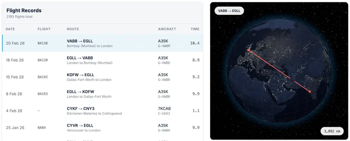
Interactive Logbook
Explore my logbook interactively flight-by-flight.
Thank you for checking out my flight stats!
This page has been a labour of love. If you have any suggestions or questions regarding this or anything aviation related, please get in touch!
I am planning to post more about experiences and insights as an airline pilot that techy people would enjoy, and also add a few more graphs to this page - thanks HN!.
If you enjoyed this, please consider subscribing to my RSS feed or following me on BlueSky or X.
Safe flying!